
Ljubomir Todorović MFA
Master of Visual Arts in the field of Graphic design. Currently employed as a Docent university professor at IBU University in Sarajevo, Bosnia and Herzegovina on the Dpt. of Graphic Design and Multimedia. Over 20 years of engagement in various disciplines of Visual Arts. Professionally oriented towards the areas of communication design while passionately exploring Visual Arts. Especially mural painting.
Contact me
Based out of
- Bosnia and Herzegovina
- (+387) 61 406 971
- todorovic.ljubomir@gmail.com


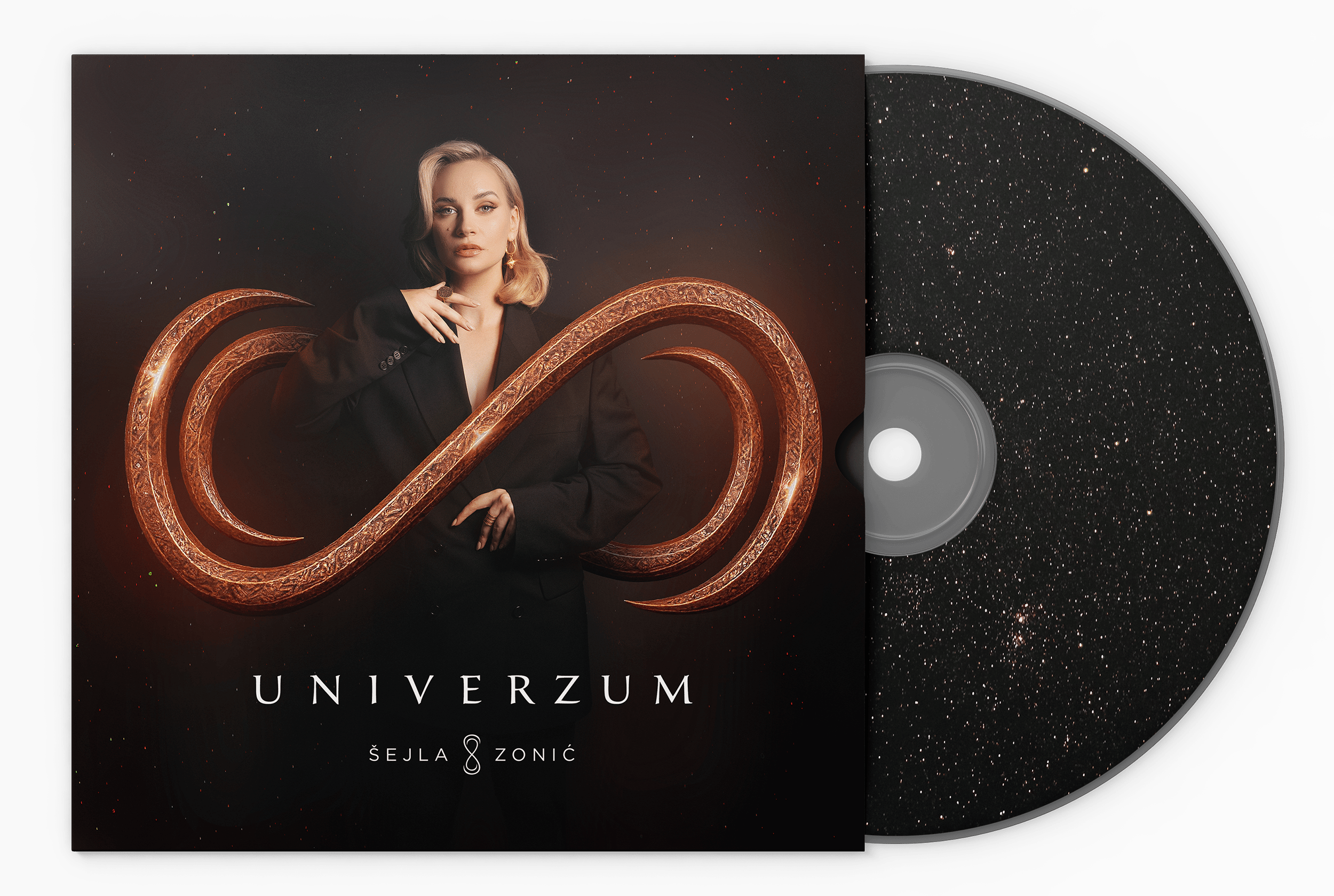
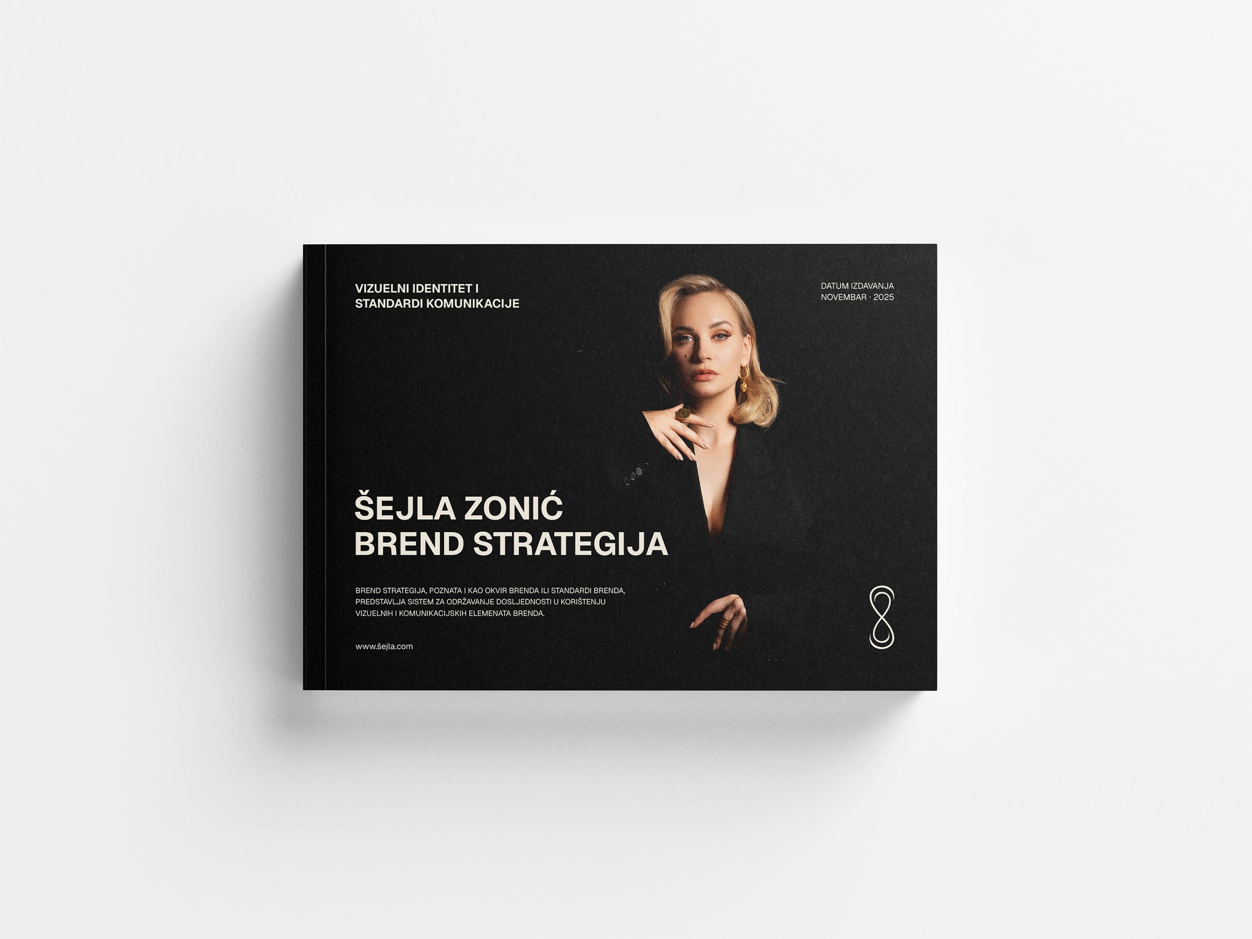
Šejla Zonić Album Cover
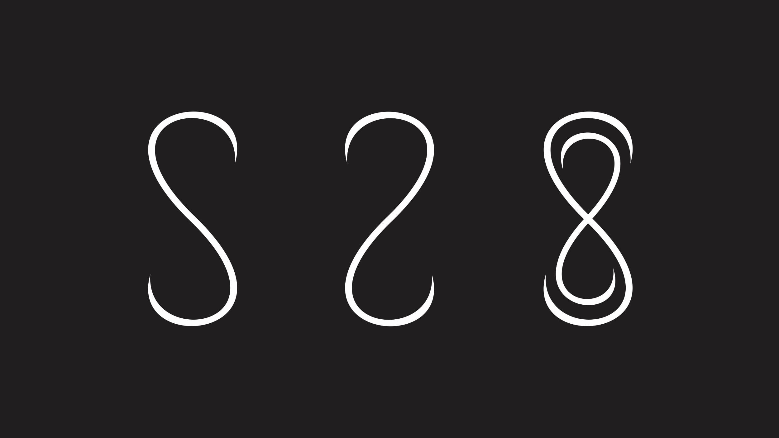
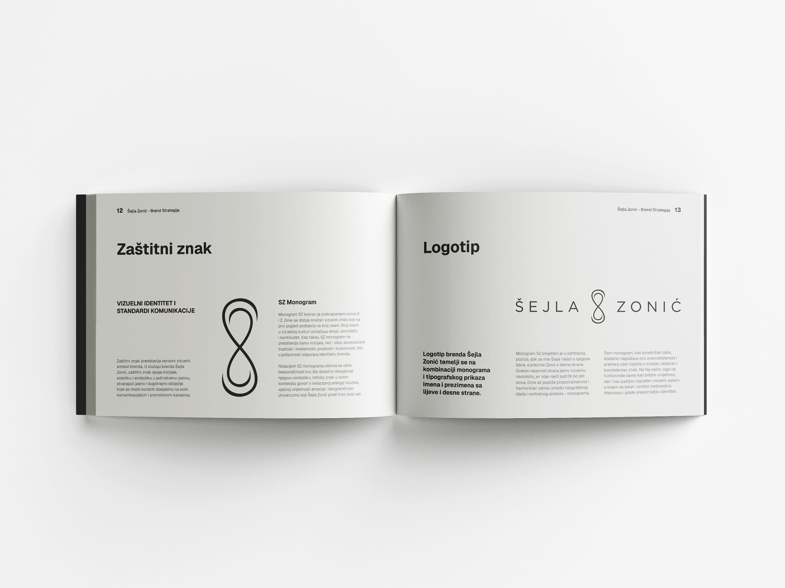
The Šejla Zonić brand strategy and album artwork design began with a deep exploration of her artistic style, emotional tone, and personal story. Through this process, we discovered the essence of her identity — a balance between powerful emotion and refined elegance. From these insights came the idea for a monogram that joins the initials S and Z. The form resembles the number eight, a symbol of harmony, balance, and infinity. It goes far beyond decoration and expresses the continuous rhythm of her music. When rotated, the monogram becomes the infinity sign, reinforcing the main concept behind her debut album Univerzum — a limitless space where sound and emotion merge.
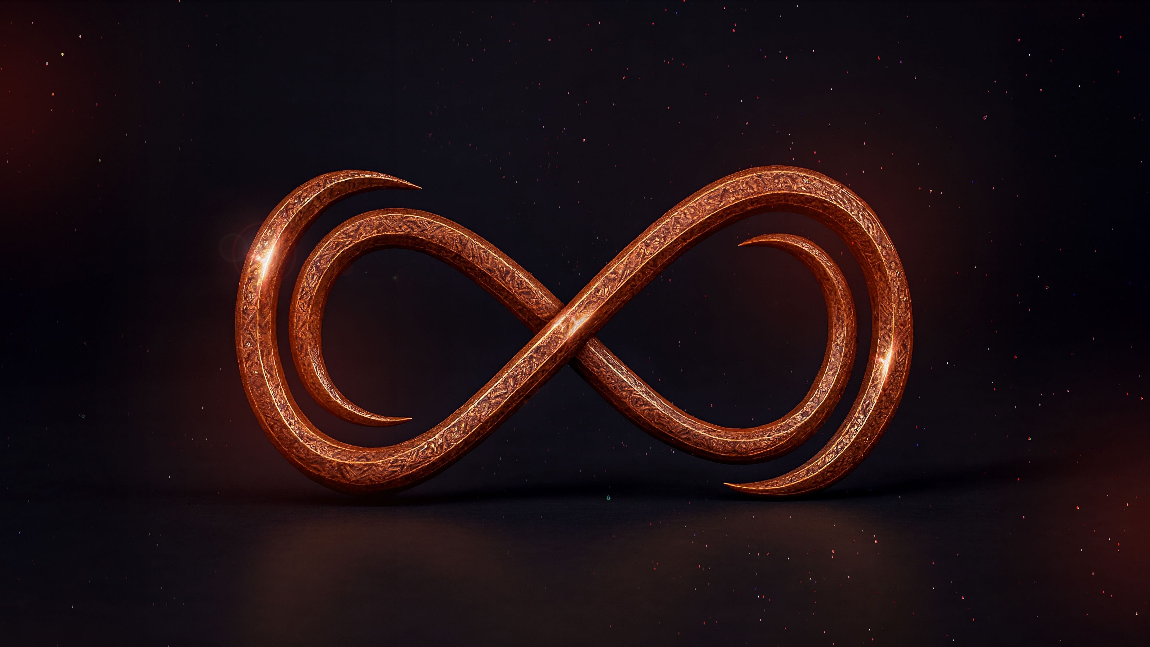
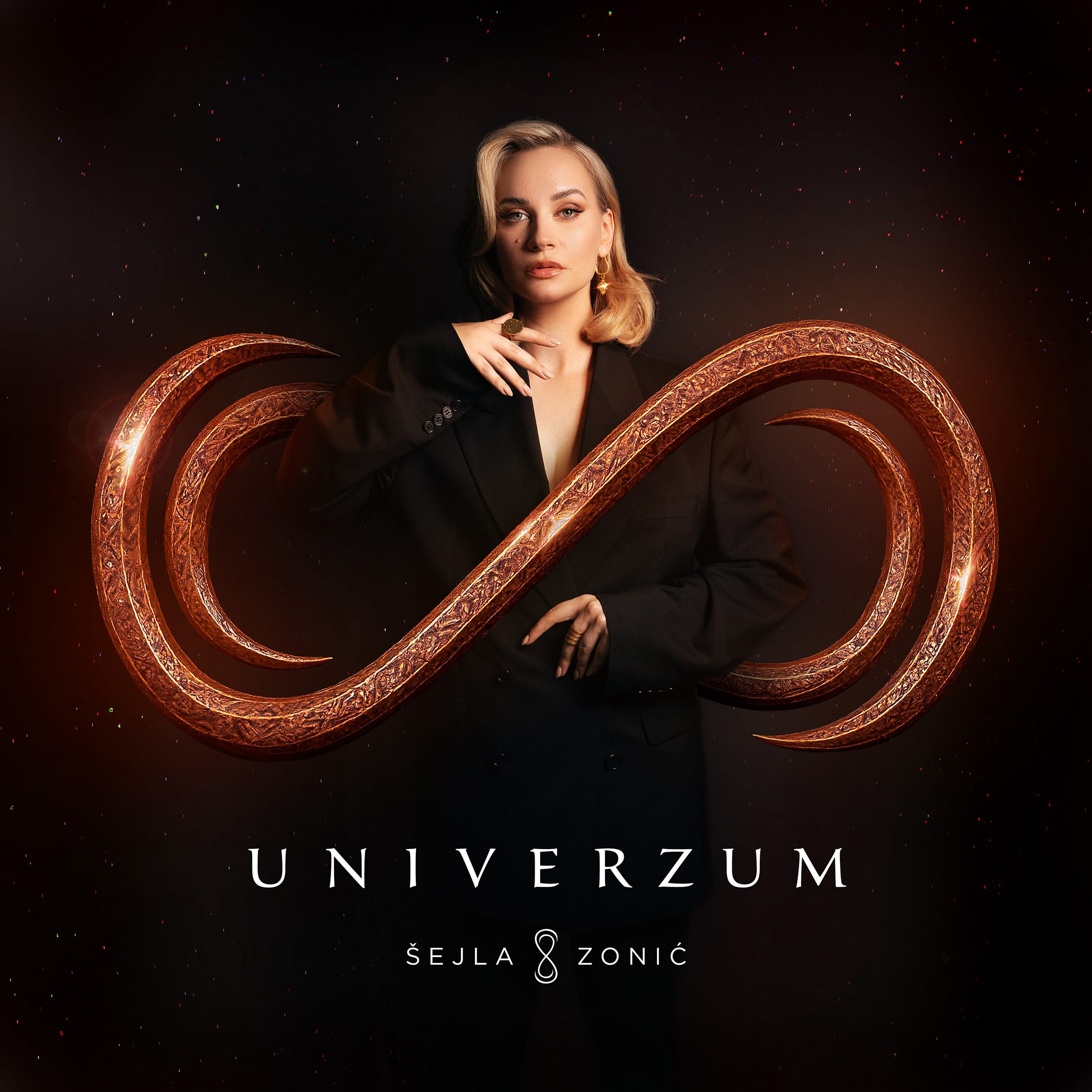
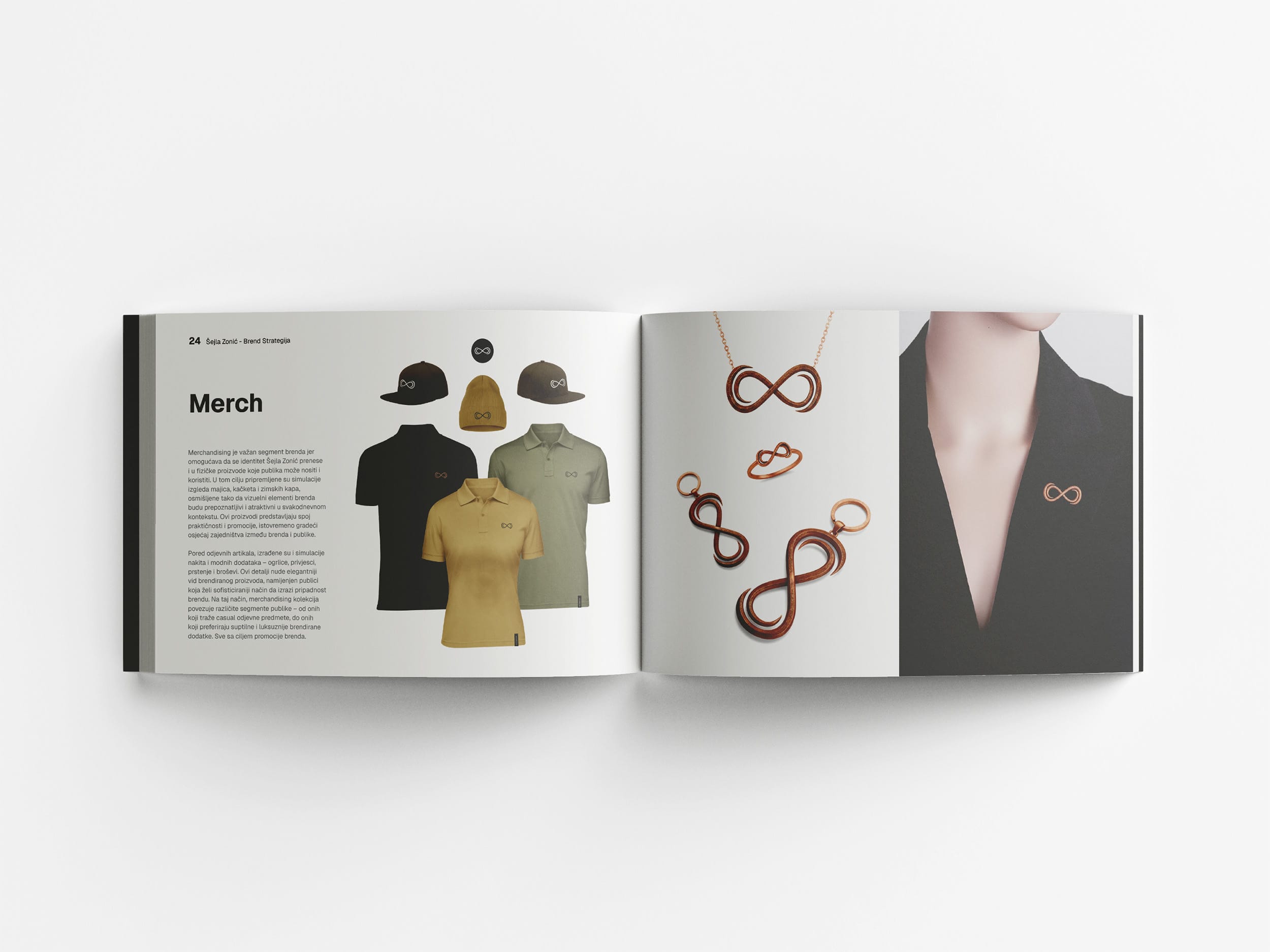
For the Univerzum album design, I crafted the SZ monogram from forged copper and integrated it around the figure of Šejla Zonić. Copper carries timeless symbolism. As a traditional material, it stands for authenticity, endurance, and heritage. However, in a modern visual context, it conveys refinement, innovation, and progress. This combination defines the spirit of the Šejla Zonić brand strategy and album artwork design — a fusion of tradition and modernity. As a result, the tactile texture of copper contrasts beautifully with the ethereal light of the album visuals, translating her balance between emotion and sophistication.
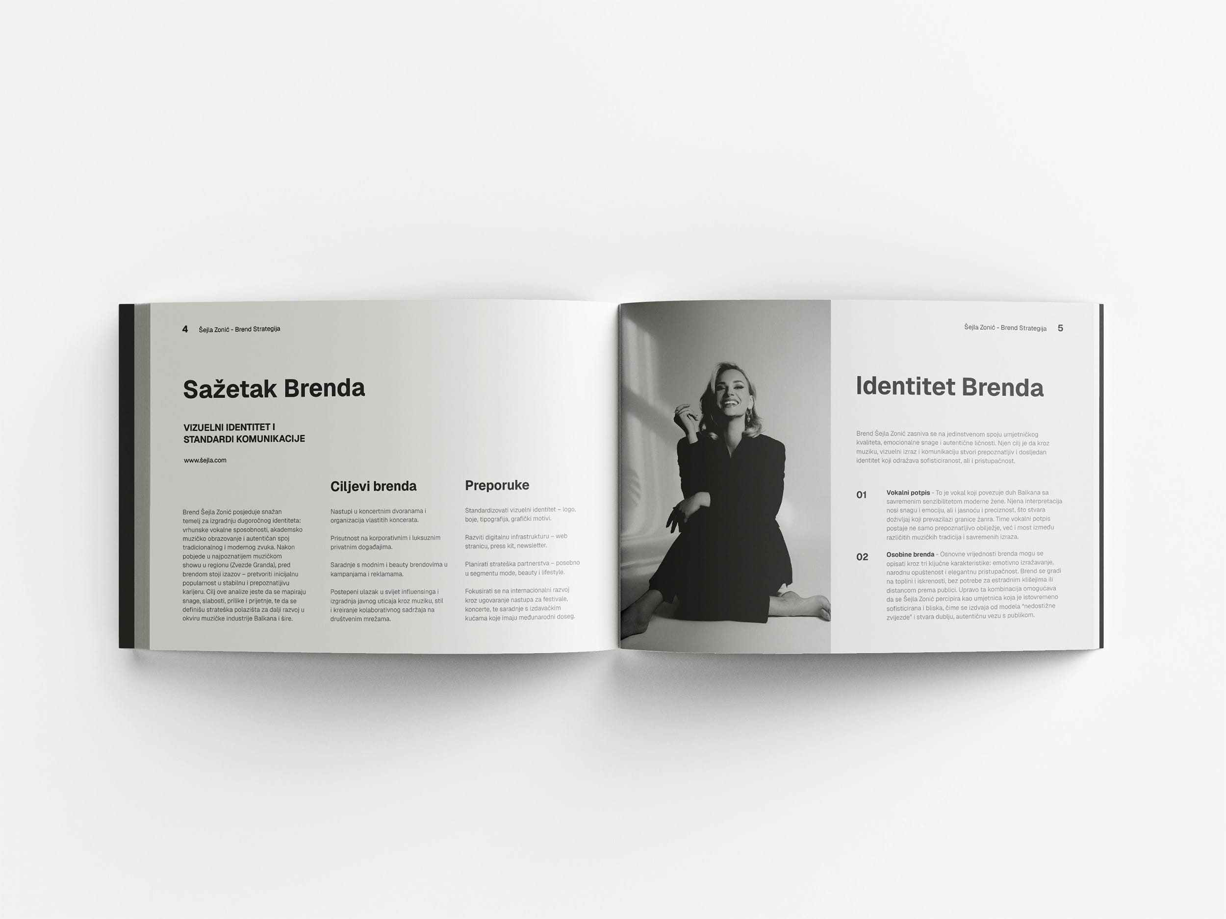
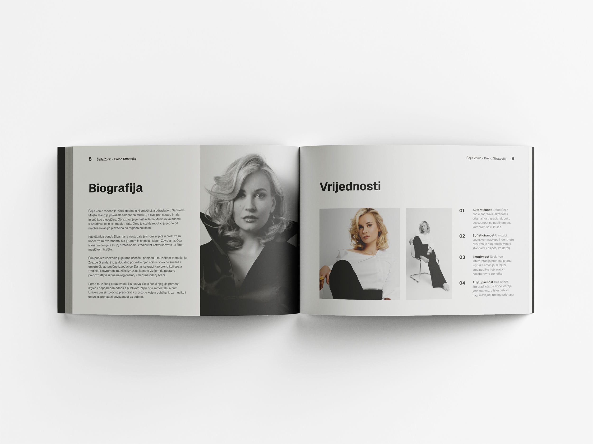
In addition, I developed a Brand Strategy Book to unify and standardize all elements of the brand’s visual and communication system. The book outlines logo usage, color palette, typography, photographic style, tone of voice, and social media guidelines. It also includes design templates and visual examples to ensure consistent use in all future campaigns, concerts, and collaborations. Therefore, every message and visual element supports a single, recognizable identity. Ultimately, the project represents a cohesive vision where design, storytelling, and sound coexist within one creative universe.
Learn more about my branding projects by visiting the communications design page
- DateNovember 6, 2025
- CategoryBranding, Communication Design

todorovic.ljubomir@gmail.com
+387 61 406 971
+387 61 406 971
© Copyright 2021. All Rights Reserved