Ljubomir Todorović MFA
Based out of
- Bosnia and Herzegovina
- (+387) 61 406 971
- todorovic.ljubomir@gmail.com
Stop, Think, Go, Do – Publication
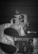
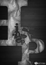
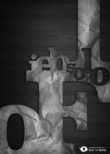
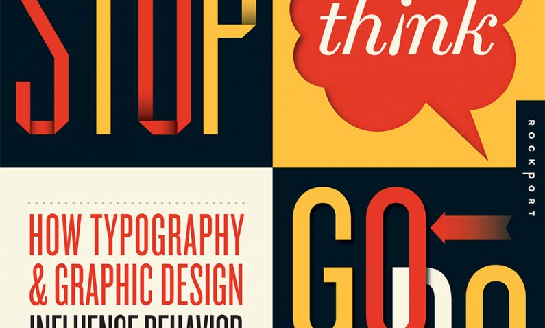
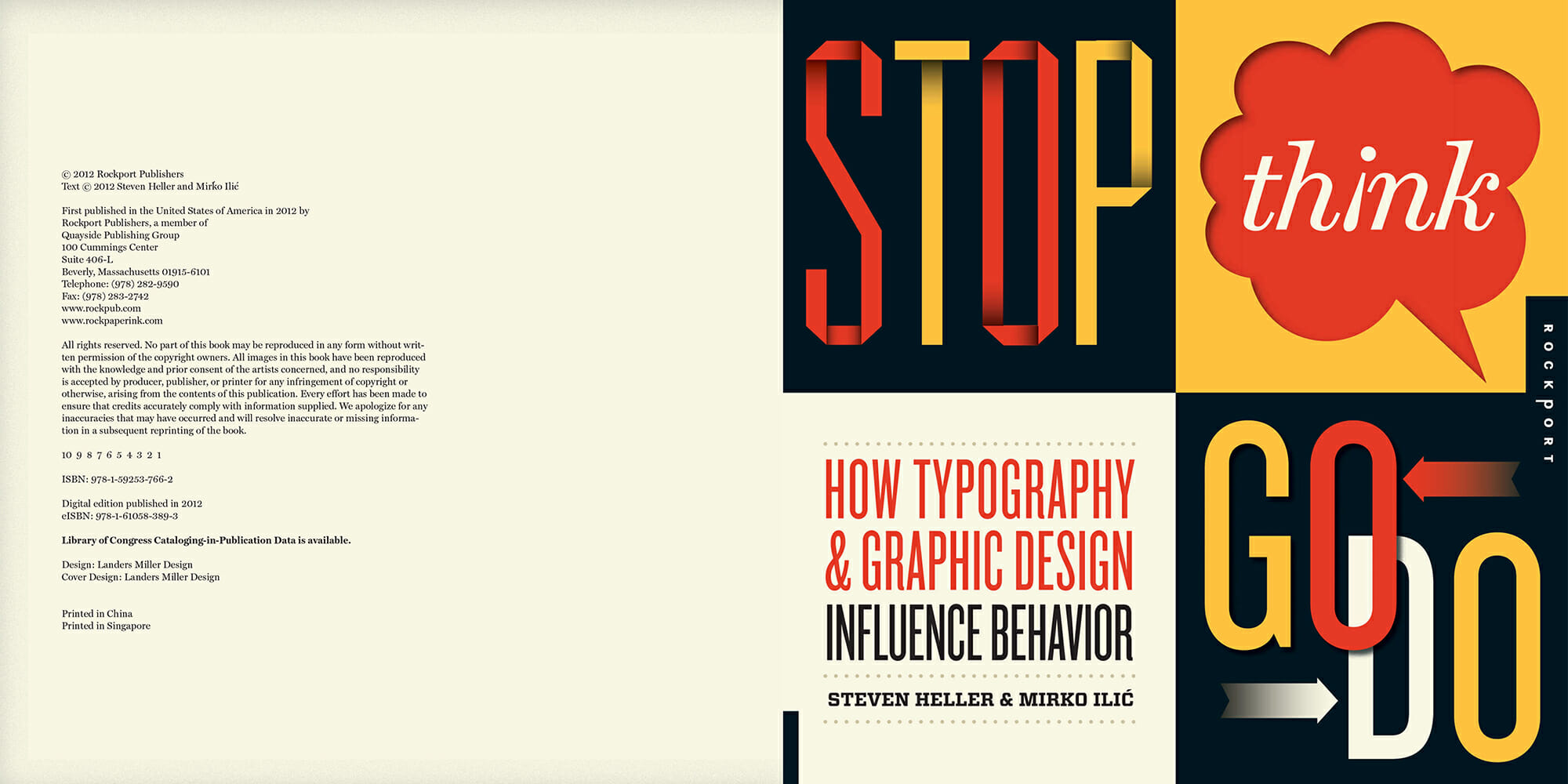
This is an interesting story, I believe. In 2012 world renowned designers Steven Heller & Mirko Ilić in cooperation with Rockport New York published a typography book called “Stop, Think, Go, Do – How Typography & Graphic Design Influence Behavior”. What is interesting is that 4 of my posters were published in that book. In order to elaborate more, I need to go back a bit.
During first years at college at the Academy of Arts of the Slobomir P University in Bijeljina (Bosnia and Herzegovina) on the course of Typography, we had an assignment called “Designing with type”. The assignment was originally created by Richard and Judith Wilde and is published as one of 20 assignments in their book “Visual Literacy”. A great book, especially because of student exercises. It varies from simple abstract exercises to full and complicated solutions and illustrations.
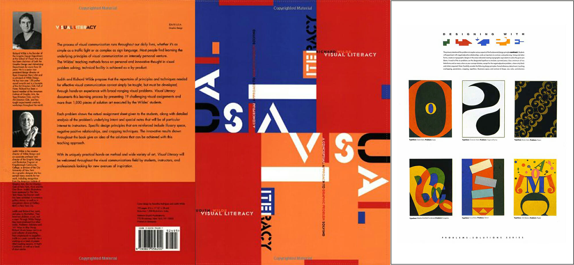
The assignment was to create graphic compositions based on the given terms like: Scale, Positive/Negative, Pattern, Congestion, Tension and Playful. Basically, using a certain typeface you are to simulate these given terms. Our professor Kosta Krsmanović made a variation of the assignment and gave us only one term – Positive/Negative. We had to create 12 different solutions. Professor as well as myself liked my work. I got an A, and that was that.
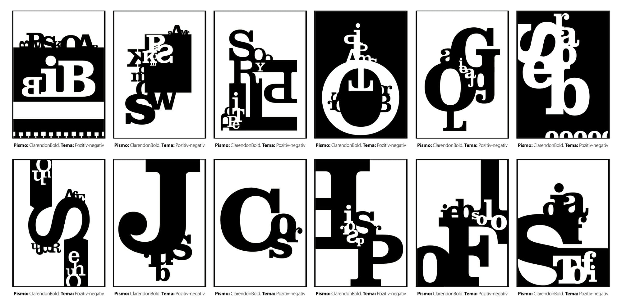
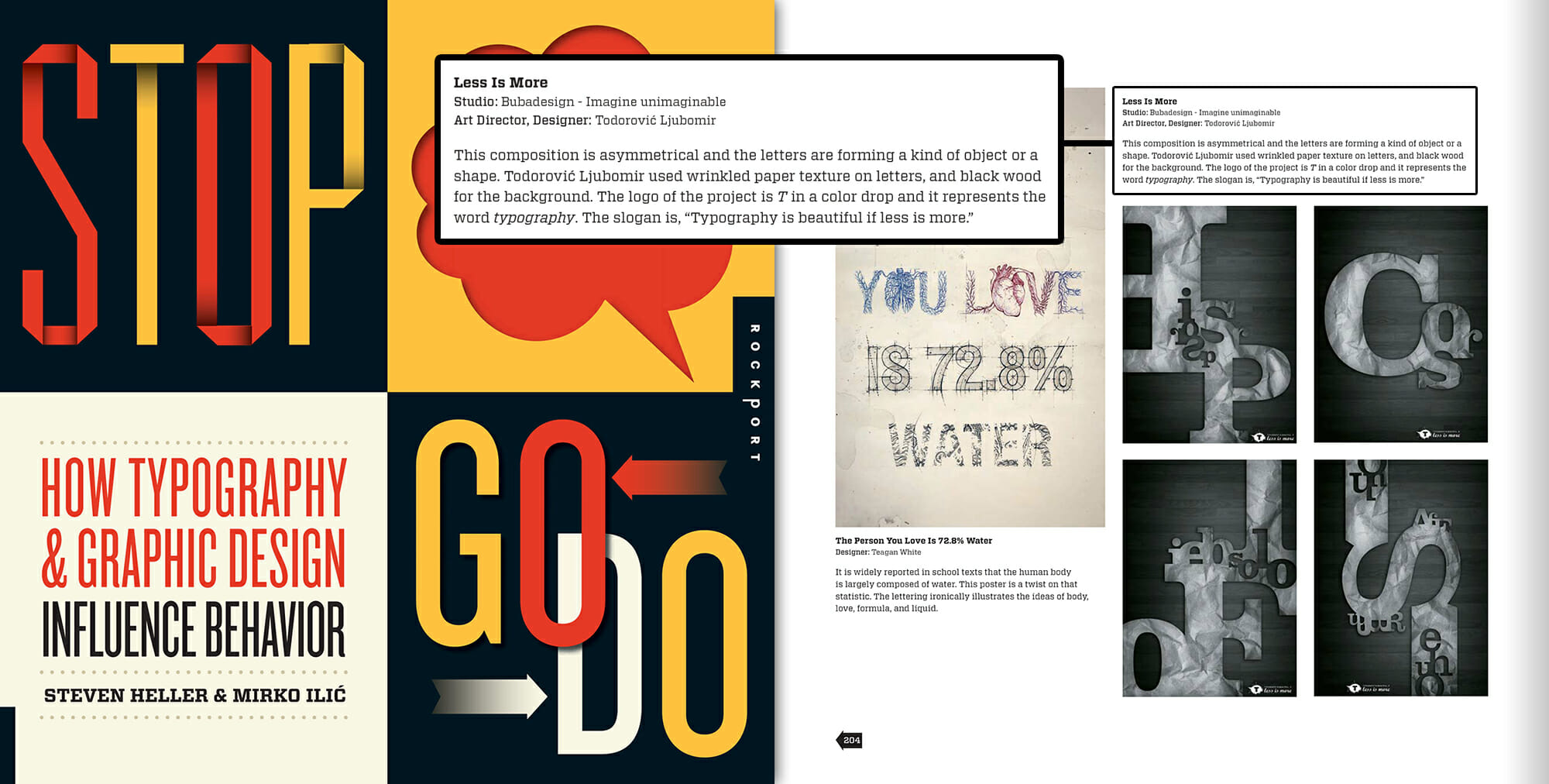
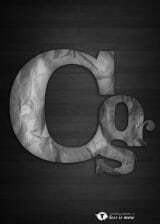
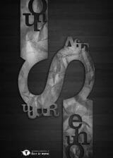
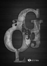
Shortly after that I saw an open call to submit typography based posters for an upcoming book that is curated by Steven Heller and Mirko Ilić. I made slight adjustments by adding texture to my works and I submitted them for selection. Low and behold, a year and a half later I was notified that my works have been selected.
So me, as a freshman got his work published in one the most prestigious design books on the planet. Next to my works I gave a short description: “This composition is asymmetrical and the letters are forming a kind of object or a shape. I used wrinkled paper texture on letters, and black wood for the background. The logo of the project is “T” in a color drop, and it represents the word “typography”. The slogan is “typography is beautiful if less is more”.”
